Facebook Dating

Team
Business Ads Growth (officially), Facebook Dating (unofficially)
Type
Business to Consumer
Intro
From hackathon to shipping & launch, used AI and behavioral data to surface shared-interest message prompts, increasing first messages within 24 hours by 21%—with 13% engaging directly with or mimicking AI suggestions.

Part one

Project overview

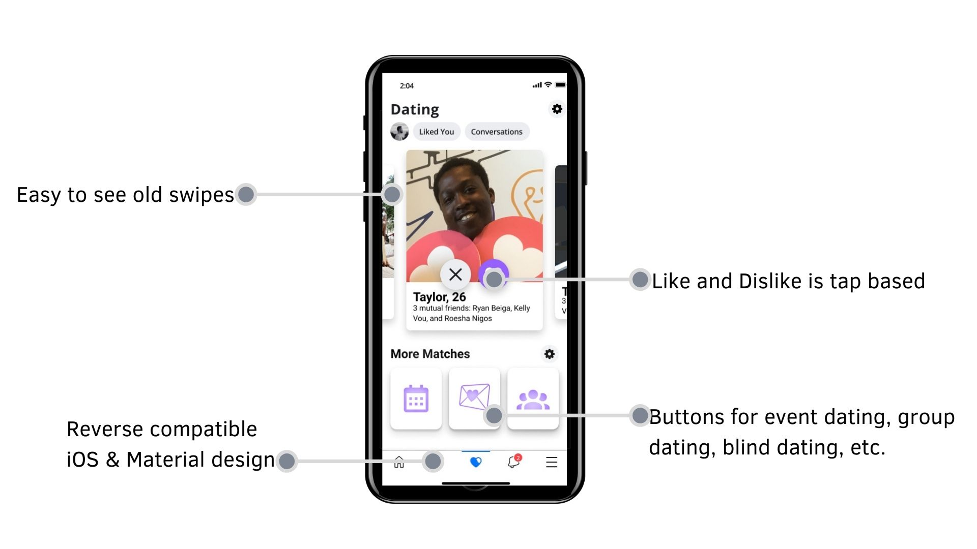
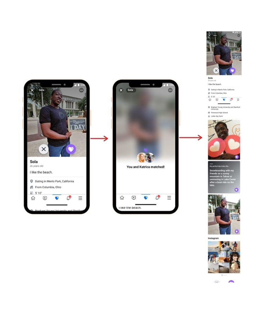
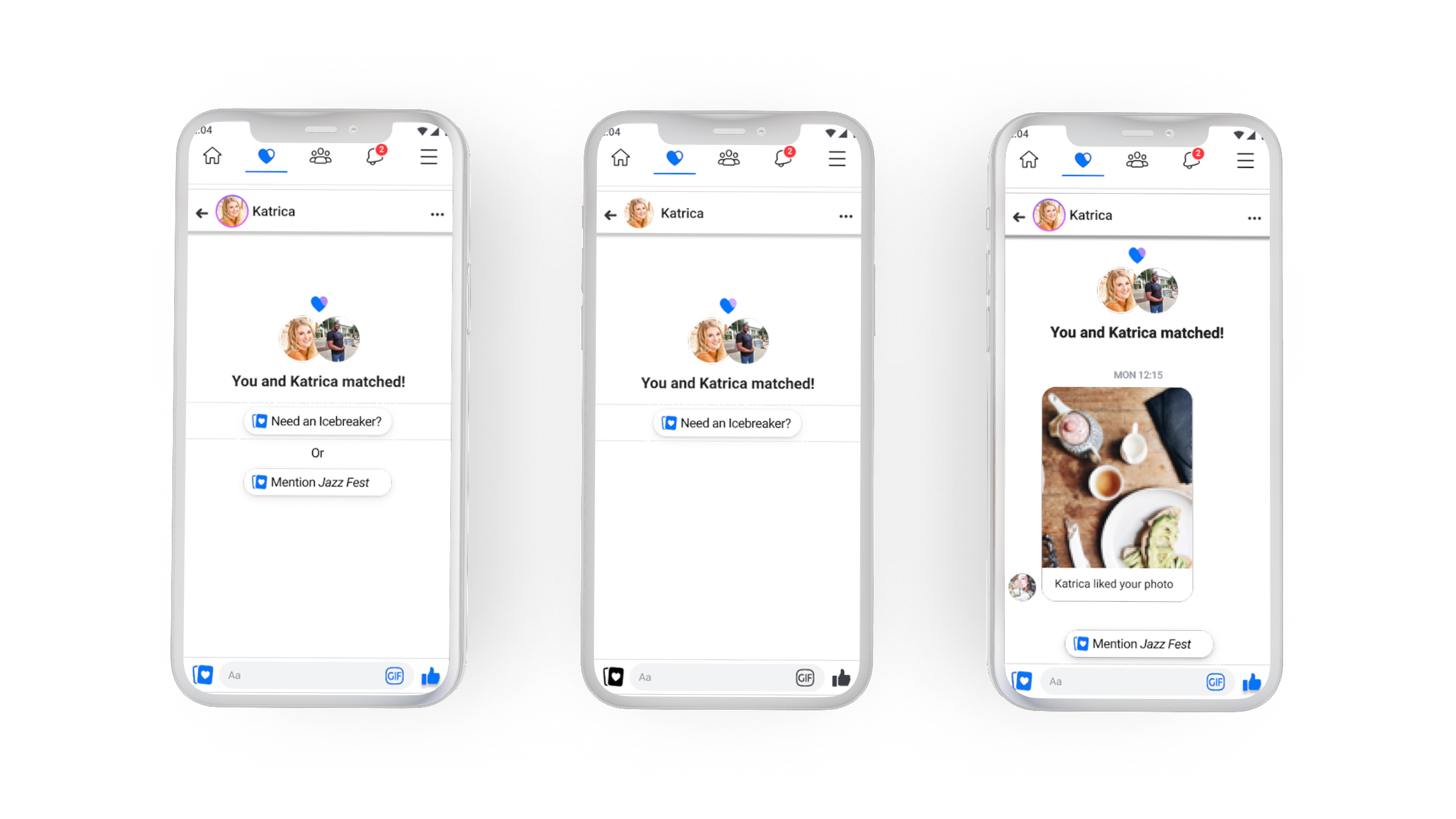
A Subtle AI Touch to First Impressions

When dating gets awkward, most people freeze up. Our team at Facebook Dating asked: what if we could use AI not to take over the conversation, but to gently nudge people toward real, meaningful connections? In this hackathon-born feature, we addressed a common user hurdle—getting that very first message sent—and shipped a smart solution.

Company

Meta, but at the time, known as Facebook

Role: Product Designer + Product Owner (Hackathon project that shipped) but normally I was a Product Designer for Business Ads Growth team.

Key responsibilities

All design work, interaction work, testing work, research work, product management work, and feature advocay work.

❓ Problem

Despite successful matches, many users weren’t initiating conversations—especially in the first 24 hours.

01

Despite successful matches, many users weren’t initiating conversations—especially in the first 24 hours. For users with limited matches, this silence felt disheartening. And for the platform, this behavior risked turning Facebook Dating into a “ghost town.”

02

"I matched, but we never talked. I don’t even know what we’d have in common."

03

This hesitation—especially around dating friends of friends—led to drop-offs and poor retention.

Type image caption here (optional)

What's the typical answer?

Inspired by military GPS vests, I designed Vestagogo—a Bluetooth-powered wearable that delivers navigational cues through vibration.

🧭 Context & Team

Hackathon Idea to Shipped Feature in 30 Days

01

Hackathon to shipped in 30 days

Normally, I was working with the Business Ads Growth team, however this project began as a general internal employee hackathon where we built additions to pre-existing products.

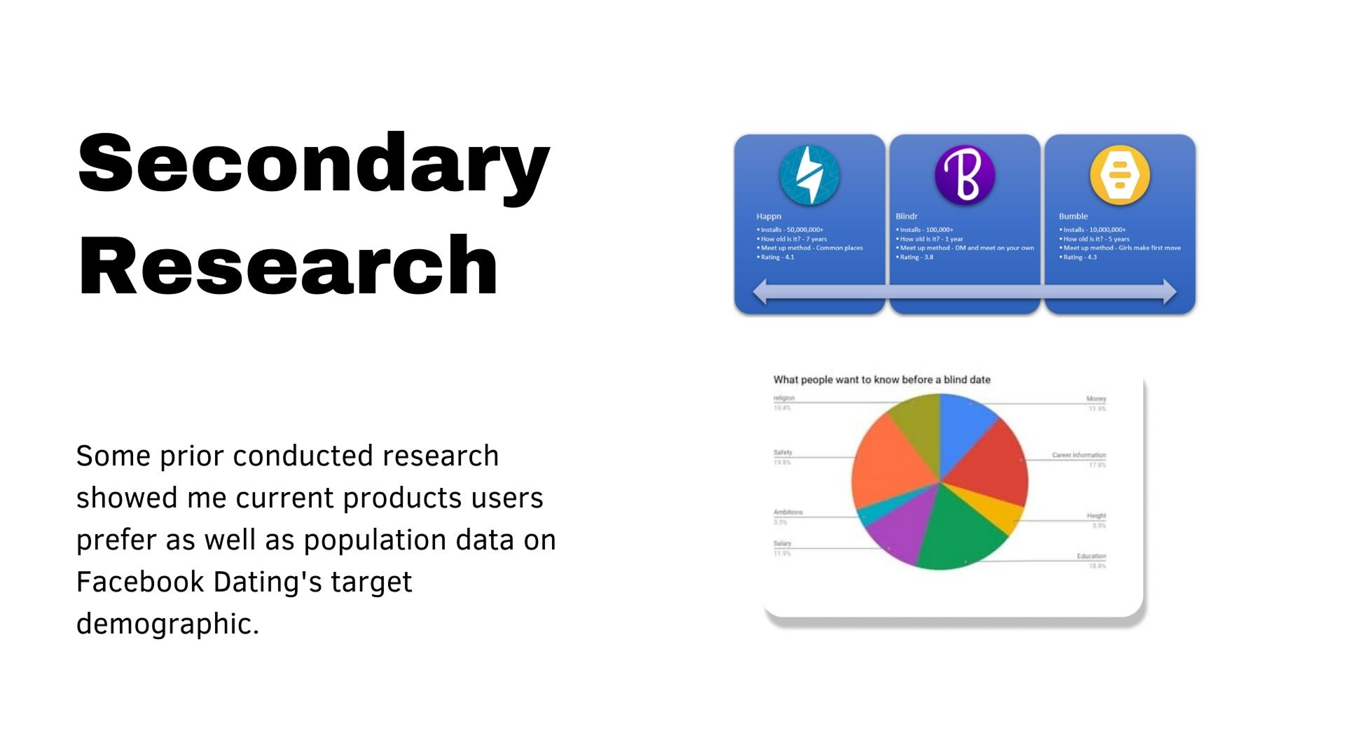
What's special about Facebook dating? 

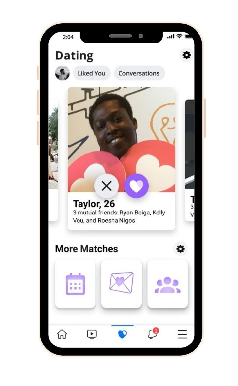
The main difference is safety when compared to competitors. Facebook dating allows users to match with friends of friends but not direct friends.

I led the initiative both as the Product Designer and Product Owner, working with a cross-functional team including a frontend developer, two backend AI engineers, and a market specialist.

After the hackathon win, we integrated our work with the broader Facebook Dating team to ship the feature to production. The full timeline: one intense, fast-paced month.

Team:

  • Myself (Product Designer + Product Owner)
  • 1 Frontend Developer
  • 2 AI Backend Engineers
  • 1 Market Specialist
  • Later: Facebook Dating PMs, Engineers, and Designers

What's the typical answer?

Inspired by military GPS vests, I designed Vestagogo—a Bluetooth-powered wearable that delivers navigational cues through vibration.

🎯 Goals & Success Metrics

The primary user goal was simple: feel comfortable enough to start a conversation. From the business side, we aimed to improve engagement and reduce churn.

01

Turning Matches into Conversations

Target KPI: Increase the rate of messages sent in the first 24 hours from 18–26% to 35%. This threshold was chosen based on comparative research from competing apps that demonstrated a 30–35% benchmark for healthy early engagement.

User goals:

  • Know what to say after matching
  • Feel more confident initiating messages

Business goals:

  • Improve platform engagement
  • Reduce silent match rates
  • Boost retention on dormant profiles

What's the typical answer?

Inspired by military GPS vests, I designed Vestagogo—a Bluetooth-powered wearable that delivers navigational cues through vibration.

🛠️ Process & Research

How did you plan your first ever role as a product owner and product designer while working a full time job for an unrelated team? 

01

Below is the blow‑by‑blow of how we moved from a spark of an idea to a measurable lift in first‑day messages. I break it into three fast loops—Research, Ideation, and Prototyping—each with a quick intro for easy skims.

🔍 Research & Data

A hackathon sprint means there’s no time for a month‑long diary study, so we scavenged insights that could be gathered (and digested) in < 48 hours.

Competitive Teardown – We benchmarked Bumble, Hinge, and Coffee Meets Bagel to see what “first‑message nudges” actually ship.

Competitive teardown: a snippet of what rival apps do to spark first messages. Full research provided on request.

Micro‑Survey (n≈600) – Shot out to an internal panel; results confirmed users feel shy without common ground.

Affinity Mapping – Sticky‑noted the survey quotes, then clustered them into four themes: appearance, shared interests, humor, and safety.

Affinity mapping turned raw survey notes into five conversation‑starter themes.

Key take‑away → Shared interests/events looked like the most actionable spark that also felt authentic.

✏️ Ideation & Concepts

Armed with the insight, we sketched every flavor of “shared‑interest icebreaker” we could imagine.

I storyboarded every idea we considered including some Oculus ones

We scored ideas on an Effort × Impact grid and quickly noticed a pattern: anything that touched the dating home screen required multiple backend services and three additional teams—translation: weeks of coordination we did not have for a hackathon deliverable.

🧪 Prototyping & Testing

The first prototype still aimed for the home feed. It showcased shared events right below a new‑match card.

Discarded v1: surfacing shared events on the home feed proved too heavy to ship.
Light summary of the changes made

Why we killed it – Engineering flagged: “Moving the home screen pipes is a month of API work and six QA sign‑offs.” Instead of swimming upstream, we pivoted to the chat entry point—already on our team’s roadmap and fully owned by us.

Initial chat options that were tested with Lean UX
Light summary of the changes made

Lean‑loop cadence

Summary of the Lean UX method and the insights at each step

With Cycle 3 outperforming the control, we green‑lit an A/B across two U.S. regions and shifted focus to safety hardening (next section).

What's the typical answer?

Inspired by military GPS vests, I designed Vestagogo—a Bluetooth-powered wearable that delivers navigational cues through vibration.

⚠️ Key Challenges

We had to solve not just what to show—but how to show it safely.

01

Building Trust and Avoiding Creepiness

Privacy Considerations

  • Only large public events (e.g., Coachella, Sundance) were used as prompt data
  • No mention of small, private gatherings (to avoid potential stalking)

Safety Transparency

  • Events and shared interests were only revealed after a match
  • Users had control over what details appeared

When There’s No Common Ground

  • If there were no shared events or interests, the prompt UI gracefully hid itself
  • We avoided forcing irrelevant or generic suggestions

How did we implement these changes? 

Only after you matched do we show that you both RSVPed to the same event. And even then only show it if there are large attendances.

What's the typical answer?

Inspired by military GPS vests, I designed Vestagogo—a Bluetooth-powered wearable that delivers navigational cues through vibration.

Final design?

🖼️ Final Mockups: Smart Prompts in Context

These three screens demonstrate how the AI prompt system flexed based on what data we had—or didn’t.

  1. Fallback + Event Prompt (Left)
    When a shared event was present but distant or too niche to assume interest, we showed both an event-based and a generic fallback prompt. This gave users the choice to lean into the shared context or play it safe.
  2. No Shared Context (Center)
    If we detected no overlapping events or interests, users saw light-touch icebreakers like “Want to ask about their favorite photo?” These aimed to reduce anxiety without sounding robotic or forced.
  3. Event-Based Prompt Only (Right)
    When a clear shared public event (e.g., Coachella) was coming up soon, we offered a confident, relevant suggestion grounded in that context—driving some of the highest engagement rates.

💡 Final Solution

We had to solve not just what to show—but how to show it safely.

01

AI-Powered, Context-Aware Message Prompts

Final Mock ups

Once users matched, the chat screen displayed subtle prompts like:

“You both plan to attend Coachella — Want to say something like this?”
"Hey! Are you doing all three days of Coachella? I’m trying to plan which sets to catch."

Design Details:

  • Prompt Display: Below the message input field, subtle and dismissible
  • Behavior: Tap to use prompt, or get inspired and type your own

Interaction Insight: Even users who didn’t tap the prompt often typed something inspired by it

What's the typical answer?

Inspired by military GPS vests, I designed Vestagogo—a Bluetooth-powered wearable that delivers navigational cues through vibration.

📈 Results & Outcomes

This project was a success! I know being the product owner in this case means I defined success so let me elaborate on why I felt it was a success.

01

From Icebreakers to Conversations

We A/B tested this feature and saw real movement:

  • 23% increase in first messages within 24 hours
  • Among users shown AI prompts, 30–41% messaged within a day
  • Positive user sentiment on the subtlety and helpfulness of prompts

The feature has since informed other engagement strategies and was included in roadmap discussions for the broader Facebook Dating team.

What's the typical answer?

Inspired by military GPS vests, I designed Vestagogo—a Bluetooth-powered wearable that delivers navigational cues through vibration.

🪞 Reflection & Learnings

What would I do different? What did I take away from this? (You know... besides advocating that everyone should try doing hackathons)

01

Collaborate Earlier

I didn’t loop in the core Facebook Dating designers until after the hackathon win. In hindsight, early alignment would’ve sped up implementation and reduced duplication. Especially since I worked for another team so I had to spend a lot of time looking for stakeholders and tracking them across the Workplace threads.

Design Lessons Applied

  • Progressive Disclosure: Revealing shared event info only after matching built trust
  • Fitts’ Law: The prompt placement made it easy to tap or ignore with minimal effort
  • Attention Bias: Centered prompts with soft visuals guided users without distracting from the chat

AI Integration

This project reinforced the value of AI as assistive, not dominant. Prompts didn’t write the whole message—they just sparked the user’s creativity.

Subtle AI is powerful when it supports—not replaces—the user’s voice.

What's the typical answer?

Inspired by military GPS vests, I designed Vestagogo—a Bluetooth-powered wearable that delivers navigational cues through vibration.

✅ Impact Revisited

So just a reminder of my impact and next steps.

01

Problem: Users weren’t messaging due to awkwardness or lack of context.

Solution: Lightweight AI prompts based on shared events.

Impact: 23% boost in messaging, better conversations, and higher confidence in the platform.

This project reminded me that sometimes the best tech isn’t loud or flashy—it’s the nudge that makes us more human.

Tools used: Figma, Origami, Facebook Events API, Internal AI Prompt Engine

Next step: I kinda went back to focusing on my work after it was done... but I knew that personally I wanted to keep exploring how to integrate predictive behaviour (not necesarily with AI, but just anticipation design) into my design solutions when I can.

What's the typical answer?

Inspired by military GPS vests, I designed Vestagogo—a Bluetooth-powered wearable that delivers navigational cues through vibration.

Fun fact: Outside of work, besides hacakthons,
I occasionally partake in techappella (www.techapella.org)