Toyota offers multiple Connected Services—like Cloud Connect, Infotainment, and Navigation—but the site failed to clarify which vehicles supported which services. How can we improve it?
Company
Toyota
Role
Product Designer
Key responsibilities
Leading a visual update, defining the design system, and pioneering web design efforts for the inhouse team to work on perpetually.
Who's impacted?
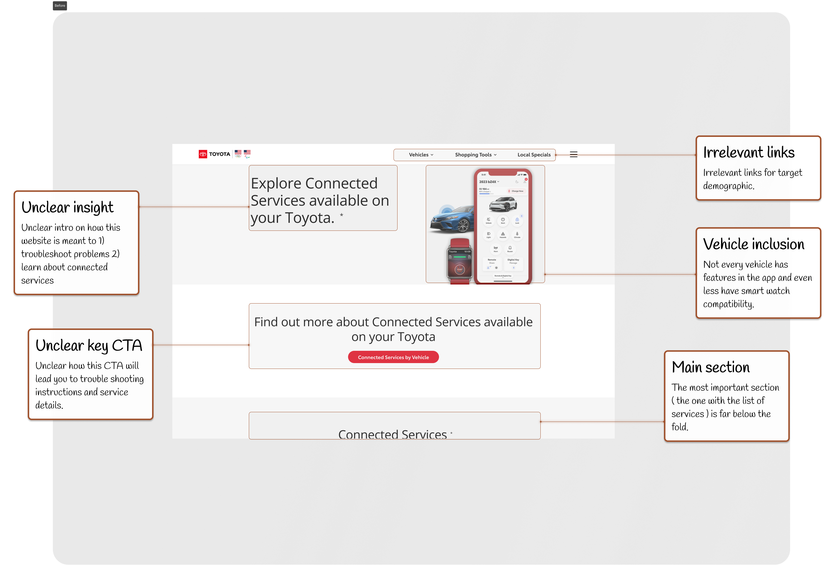
The website didn’t make it clear which services were compatible with which car.
02
New Toyota buyers (30%) were overwhelmed by vague support content after purchasing vehicles with new infotainment systems.
03
Lexus owners (10% of sales) couldn’t find features relevant to their models.
What's the typical answer?
Inspired by military GPS vests, I designed Vestagogo—a Bluetooth-powered wearable that delivers navigational cues through vibration.
Highlights
Tools I used the most
02
Skills & Methods
Ergonomic design, interactive workshops, Personas, usability testing, content system management
Tools
Figma, Framer, webflow.io, uTest, Maze (for user testing) and adobe illustrator. (also an addictive amount of green tea)
What's the typical answer?
Inspired by military GPS vests, I designed Vestagogo—a Bluetooth-powered wearable that delivers navigational cues through vibration.
My problem
Roughly 30% of buyers are confused about the compatibility of the New Toyota Infotainment system.
02
12.4min flows
Users were spending on average, 12.4 minutes trying to figure out how to use and troubleshoot issues with their car. And in the process, many gave up or abandoned the site in frustration while the more determined ones simply ignored the website and tried to get their questions answered with our phone representatives.
03
10% of annual sales
Lexus owners, who make 10% of Toyota's annual sales, were the largest demographic struggling to identify the multimedia services compatible with their vehicle.
What's the typical answer?
Inspired by military GPS vests, I designed Vestagogo—a Bluetooth-powered wearable that delivers navigational cues through vibration.
My Impact
What did this project accomplish?
02
70% reduction in average search times
With my changes implemented, there was a 70% reduction in search times for the first time users and a 50% reduction in search time for returning users within 4 months after my updates were shipped.
03
41% reduction in customer service calls
After implementation, there was a 41% drop-in customer service calls over the first 4 months of the features being shipped, and thus saving over $200,000 per week on call hours.
What's the typical answer?
Inspired by military GPS vests, I designed Vestagogo—a Bluetooth-powered wearable that delivers navigational cues through vibration.
💡 The Solution
We explored three possible paths:
02
AI Search Assistant Initially popular, but not globally scalable due to complex natural language and localization needs.
03
Auto Account Indexing Pulls your connected vehicle from the Toyota app to tailor search results—but privacy/legal barriers slowed development.
04
Subject-Based Filtering (Chosen Solution) Let users pick their car model first, then show compatible services in simple categories like Infotainment or Navigation.
What's the typical answer?
Inspired by military GPS vests, I designed Vestagogo—a Bluetooth-powered wearable that delivers navigational cues through vibration.
Defining the problem
But how did we get there? First, we focused on the opportunity and hypothesis.
02
Opportunity
The website doesn't have a dedicated UX designer, so this was a chance to not only help with trouble shooting, but also help explore the new Connected Services my team was working on.
Hypothesis
If we reduce the number of steps to complete all possible actions, we will reduce the number of confused customers dramatically.
What's the typical answer?
Inspired by military GPS vests, I designed Vestagogo—a Bluetooth-powered wearable that delivers navigational cues through vibration.
Research
This study focused mostly on rapid testing of mid fi and high fi prototypes based on micro adjustments to the current web design. It is rooted in Segmented Lean UX.
02
What's a Segmented Lean UX approach?
So, we had our three potential solutions: AI search, Toyota account login, and thematic filtering. But how did we get from those initial concepts to a fully-fledged, user-friendly experience? The journey was a carefully orchestrated blend of user insights, iterative design, and cross-functional collaboration. Here's how it unfolded:
So to test this, we did a Segmented Lean UX methodology where we went 1 section at a time, made several mid fi options, and used those changes to design the final version !
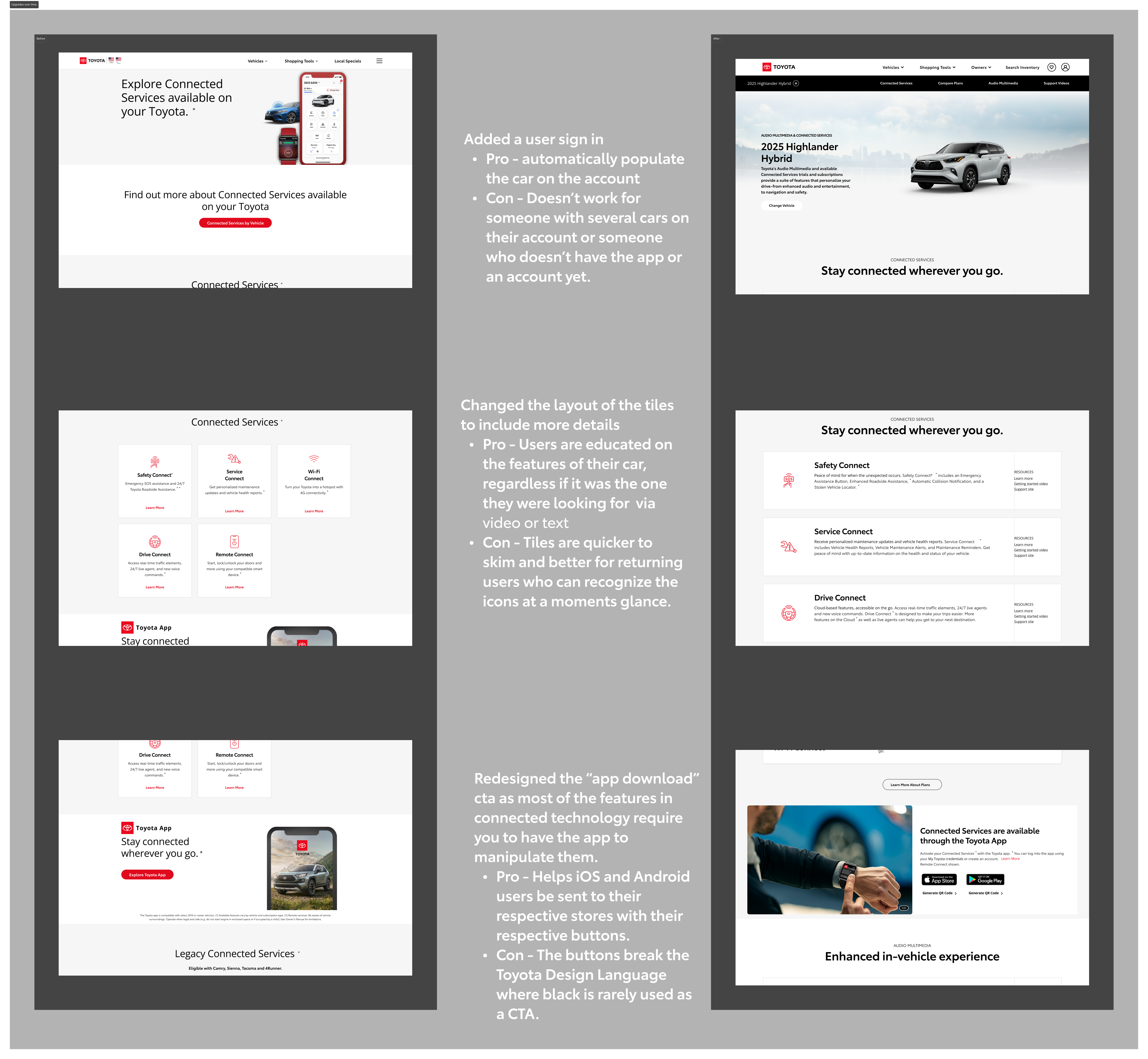
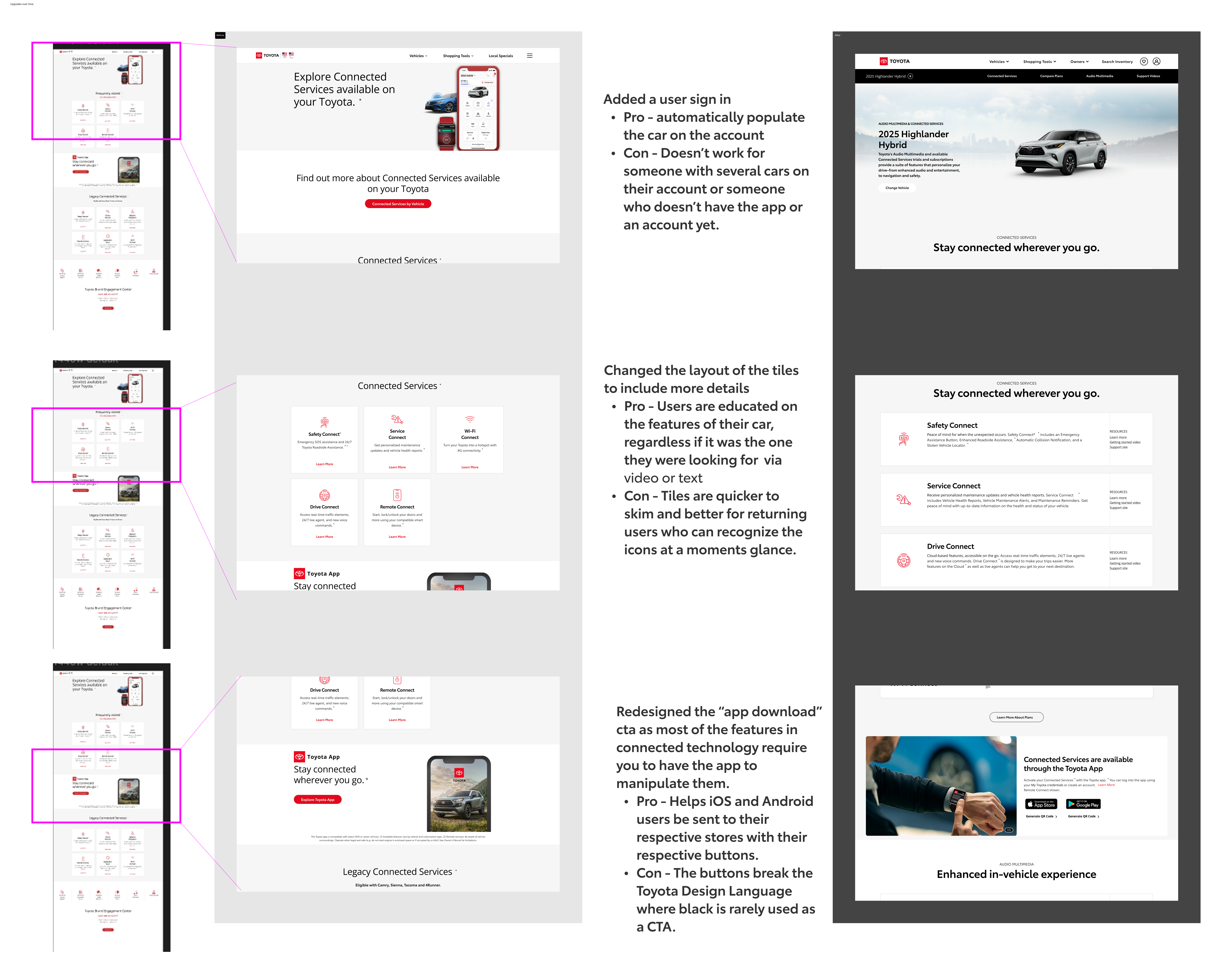
Example of 3 sections being redesigned and their differences side by side
I.e., we redesigned each section ( section as in the gray and white sections you see on the left images ) at a time by analyzing each part of it and optimizing the components for usability.
What's the typical answer?
Inspired by military GPS vests, I designed Vestagogo—a Bluetooth-powered wearable that delivers navigational cues through vibration.
How do you optimize a single section at a time?
Everything began with our users. We dove deep into understanding their pain points, leveraging both quantitative and qualitative data.
01
Data Dive: Heatmaps showed us where users were getting stuck, while surveys revealed their frustrations in finding the right services for their vehicles
02
User Empathy: We spoke directly with users, understanding their needs and expectations in their own words. These conversations fueled our design decisions and kept us grounded in reality.
What's the typical answer?
Inspired by military GPS vests, I designed Vestagogo—a Bluetooth-powered wearable that delivers navigational cues through vibration.
Cross-functional stakeholder collaboration
For a single section, this is how I would walk though it for a team
01
Data Dive: Heatmaps showed us wh
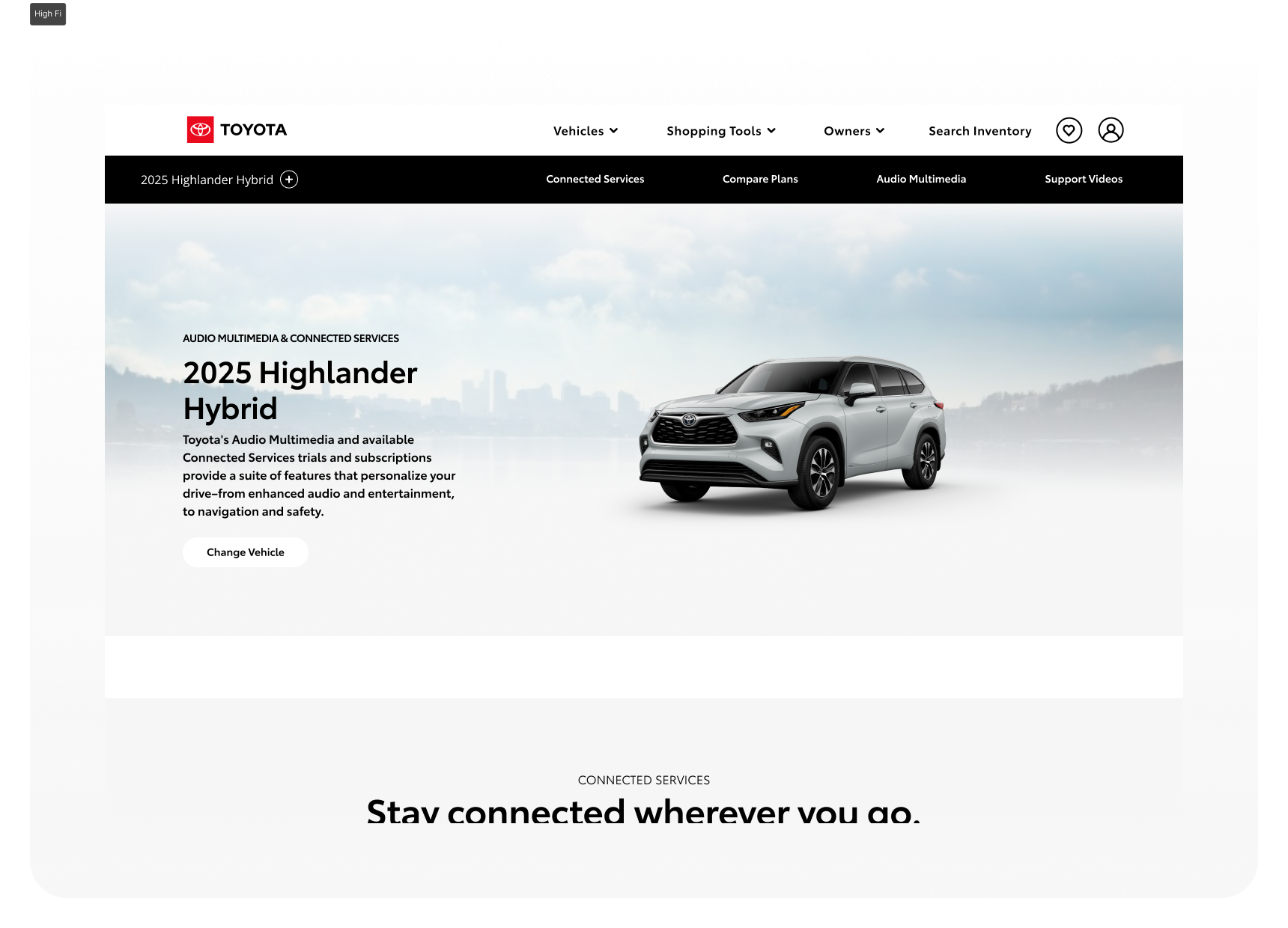
First I took a section ( let's call this one Section 1 because its first ) ...
Original version of this section on the home page.
Next we analyze the weak points of the current section we see. This way we can reuse as much as possible without starting from scratch and, thus, save devleopment time and resources.
A few of the friction points of the original
After that, we make some mid fidelity mock ups ( we didn't start with lo fi because this time, we want to remember to maintaine the current "structure" as much as possible for development )
A few of the dozens of mid fidelity screens designed
After we had the mid fidelity screens and cleared them with the product owners and engineers, I took their insights to make the Alpha version of the screen.
Section 1 version used for alpha testing
User testing with the alpha prototype was conducted to verify our assumptions for each section. Now that you get the process I took, let's focus on how this improved search.
What's the typical answer?
Inspired by military GPS vests, I designed Vestagogo—a Bluetooth-powered wearable that delivers navigational cues through vibration.
Why this approach?
Now the above example was mostly to introduce you to the order of how research prototypes were made. Only a few sections would be able to significantly impact our Searchability.
01
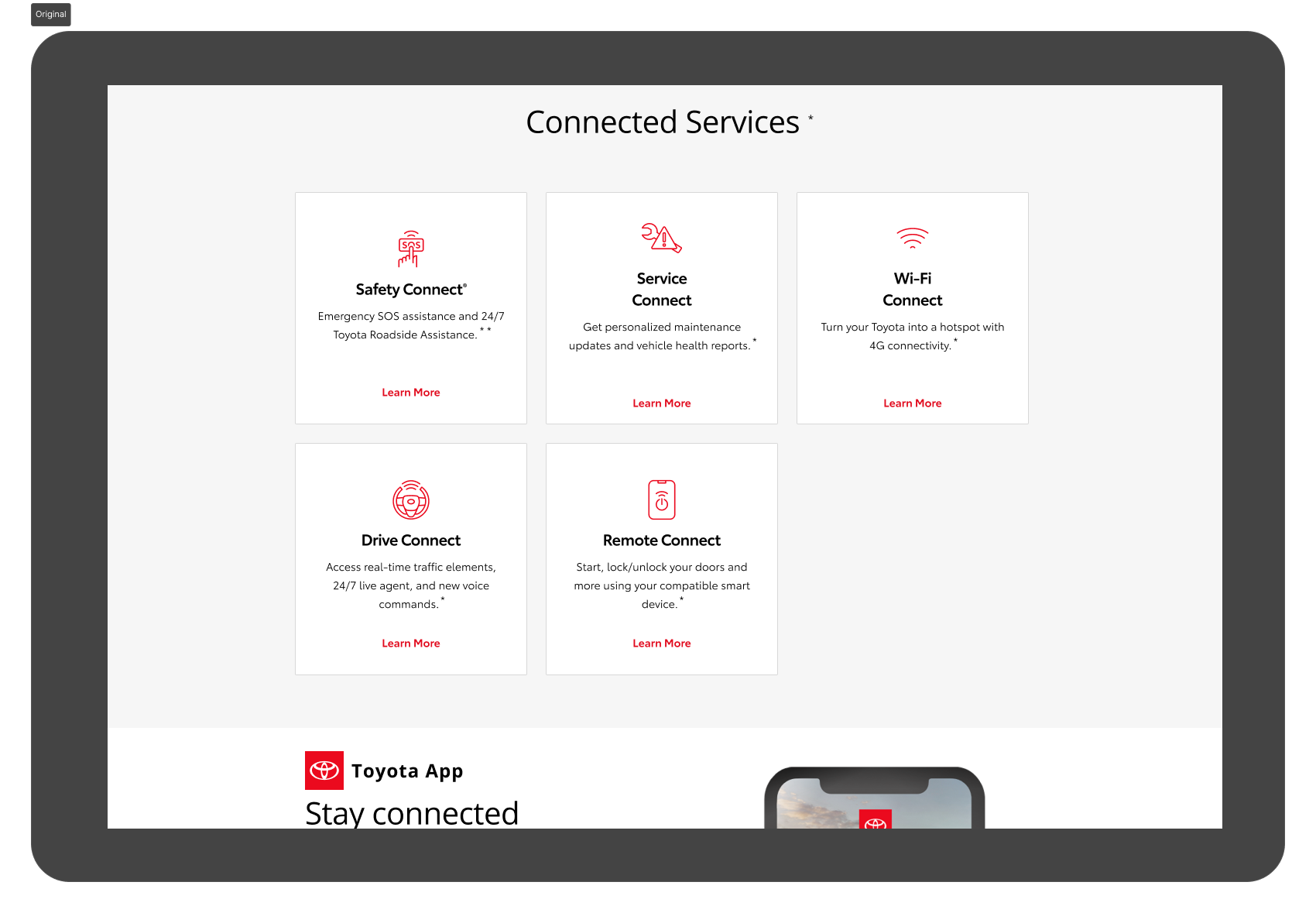
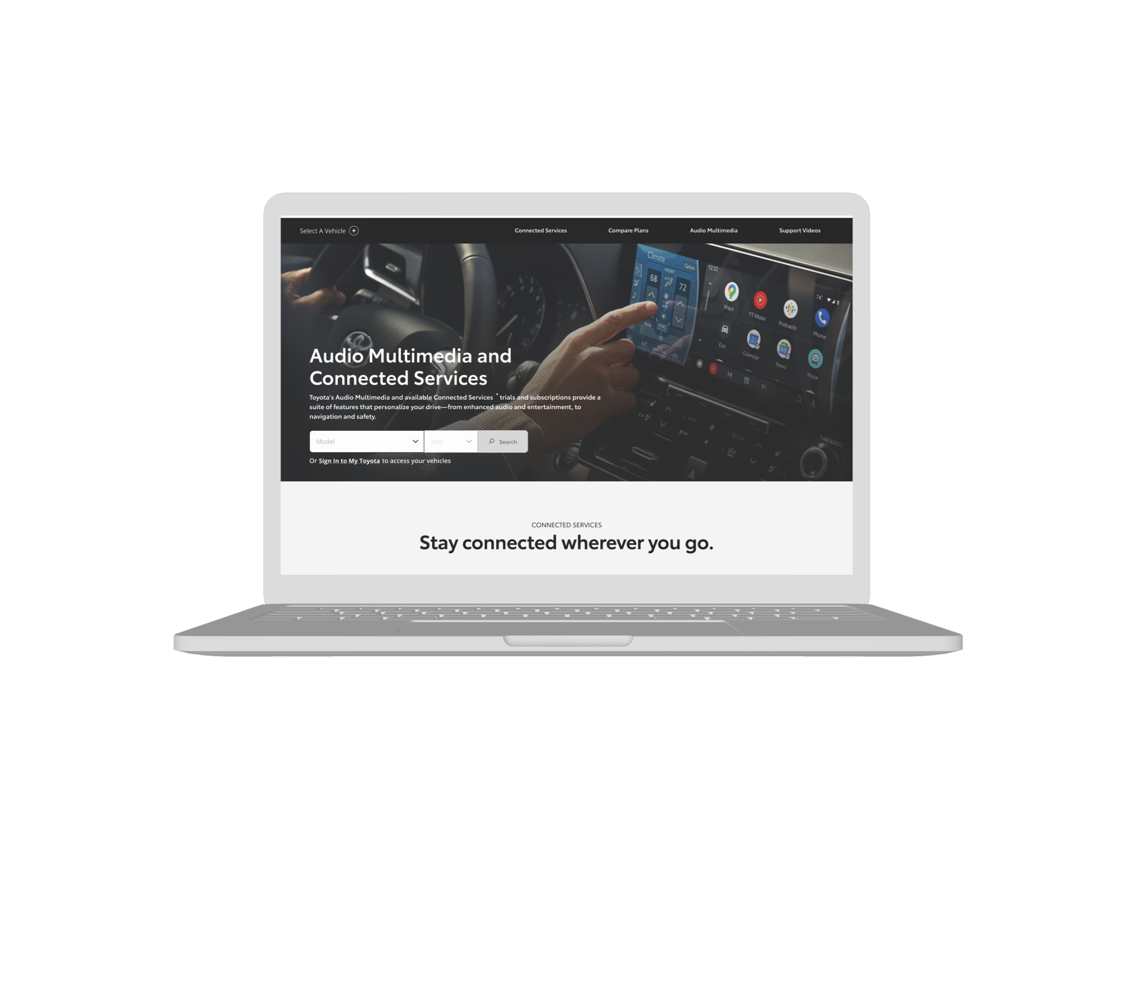
After watching several dozen heatmap summaries of the behaviour of thousands of users, I concluded the best section to adjust was this one:
Let's call it Section X
Section X featured a lot of users clicking here, going back, and clicking somewhere else often so it was a good target for this task.
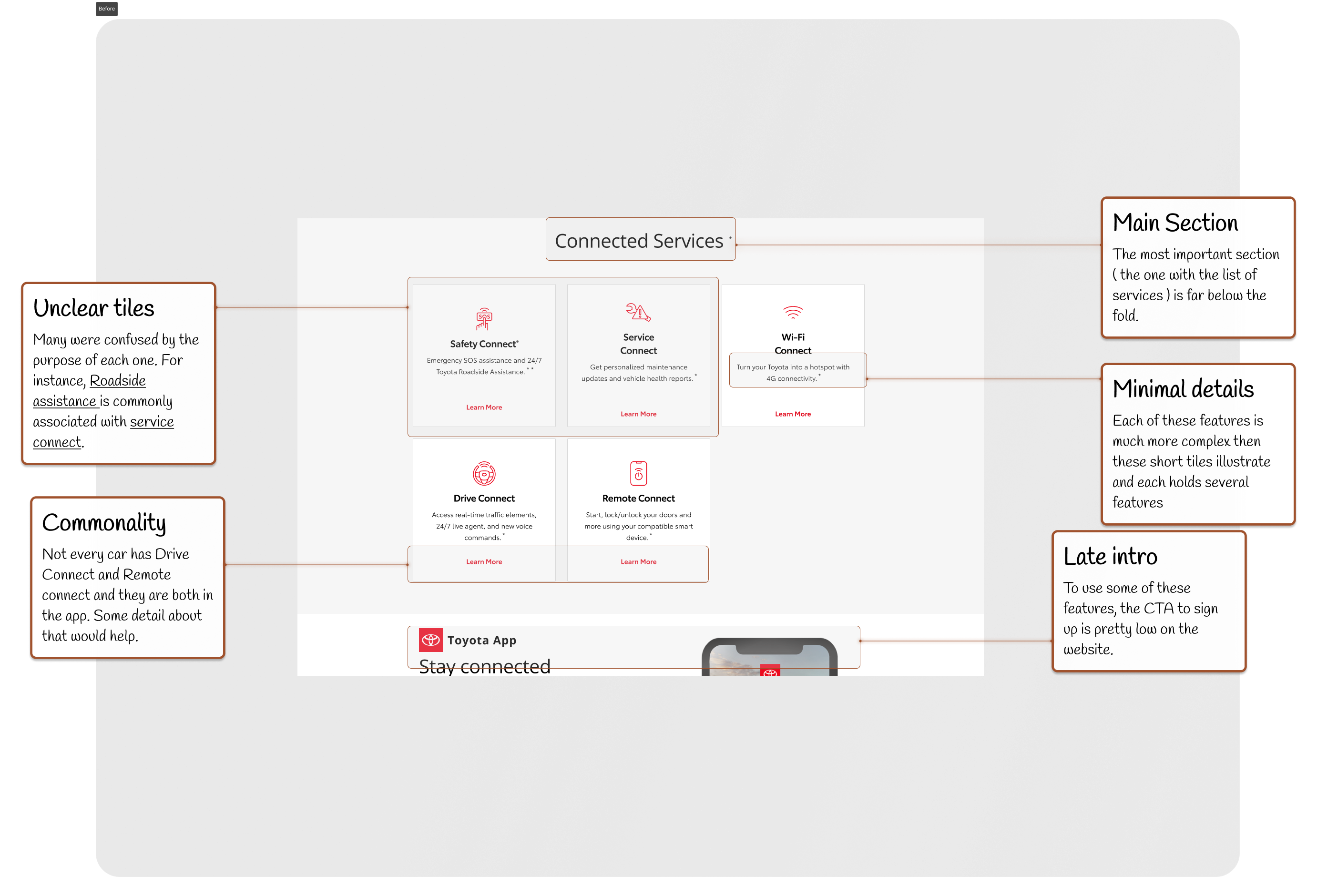
A few key issues with Section X
Based on our personas ( someone who is troubleshooting and looking for more information ) I explored about a dozen possible solutions in mid fidelity to redesign this section that would meet both expectations.
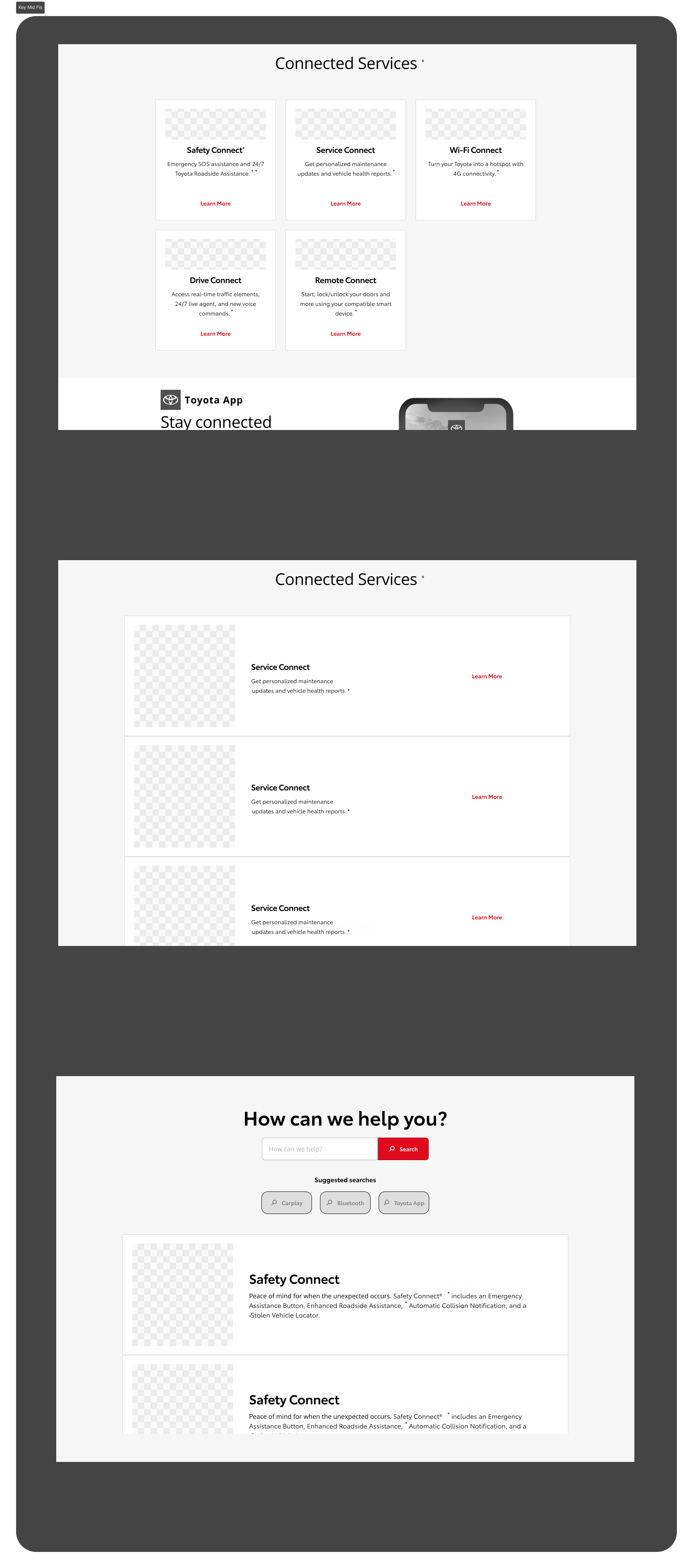
A handful of considered mid fidelity designs
I settled my first version for alpha testing as the one below because it encouraged people to skim and learn all the features of Connected Services. The product owner and product manager loved this idea because it would teach users more about other products when they search for new products.
Alpha Version of Section X for initital testing.
Once the initial test versions were done, I conducted a few usability tests internally with people who don't own a Toyota personally as well as guests at a local dealership. But this section is getting too long, so I will move on to the outputs of the research.
What's the typical answer?
Inspired by military GPS vests, I designed Vestagogo—a Bluetooth-powered wearable that delivers navigational cues through vibration.
"Oh great, another persona section," I hear you groan (or at least imagine you groaning!). I get it. Personas can sometimes feel like portfolio filler. But trust me, in this case, they're absolutely essential. The Toyota Connected Services website serves two primary user groups:
Why them?
Now, while I worked on redesigning many different sections of the site to address the different problems they both faced, this case study specifically focuses on the search, where I wanted to remove friction and enable both of them to reach what they were searching for. Both users need to be able to find what they are looking for with low friction.
These personas aren't just window dressing. They represent real people with distinct goals, needs, and frustrations. Understanding their unique perspectives was paramount to creating a search experience that catered to both groups without compromise.
01
The New Explorers: These are recent Toyota buyers, fresh off the lot and eager to discover the digital perks that come with their new ride.
02
The Troubleshooting Pros: These are seasoned owners, often working with customer service, seeking quick solutions to specific multimedia issues.
What's the typical answer?
Inspired by military GPS vests, I designed Vestagogo—a Bluetooth-powered wearable that delivers navigational cues through vibration.
Part three ideation
🔧 Light Process
🧪 Lean UX, Section by Section
Section Audits - Reviewed heatmaps, friction points, and voice-of-customer feedback
Mid-Fi Mockups - Created dozens of variants per section to balance new UI with existing structure
Alpha Tests - Internal Toyota team and local dealership visitors tested prototypes
Collaborative Workshops - Brought in PMs, CS reps, and other designers to align on service categories
Visual Redesign - Added clearer calls to action, category icons, and vehicle-specific options
Employee feedback
Our primary challenge was addressing the inefficiency of Toyota's Connected Services website. Users were struggling to navigate and troubleshoot, often encountering irrelevant information due to the site's one-size-fits-all approach.
For this round, I was sure to reach out to other designers on another team as well as other employees in non-product facing roles. This way, I got a wide variety of opinions internally and quickly.
01
With the core component established, we moved to integrate it into Toyota's existing design system. This integration process involved: Collaborating with the design systems team to ensure consistency
Working with front-end developers to implement smooth animations and transitions
Creating high-fidelity mockups for every Toyota make and model using Photoshop and Figma as well as some old Sketch files
Developing custom SVG icons for each connected service to enhance visual communication.
Side by side comparision of the before and after.
What's the typical answer?
Inspired by military GPS vests, I designed Vestagogo—a Bluetooth-powered wearable that delivers navigational cues through vibration.
Designer feedback
So both alpha tests went well enough right?
Well that's not enough for me.
Since we finished nearly 2 weeks ahead of schedule, I wanted to spend this time as productively as possible. Now personally, I don't stop designing when I get a good solution. Instead, I go to other teams and make sure that my solution works well for any and all possibly involved stakeholders.
01
After the alpha testing, these were some things we learned about our new design.
Updates based on feedback
We got generally positive feedback from the alpha test for section 1 as replacing the stock photos with custom vehiles helped users relate to the app more while concurrently ensuring users selected the right vehicle.
We also had a clear way to change vehicles and a clear way to search or go though personal account settings relating to connected technologies. However, Section X wasn't as simple or well recieved.
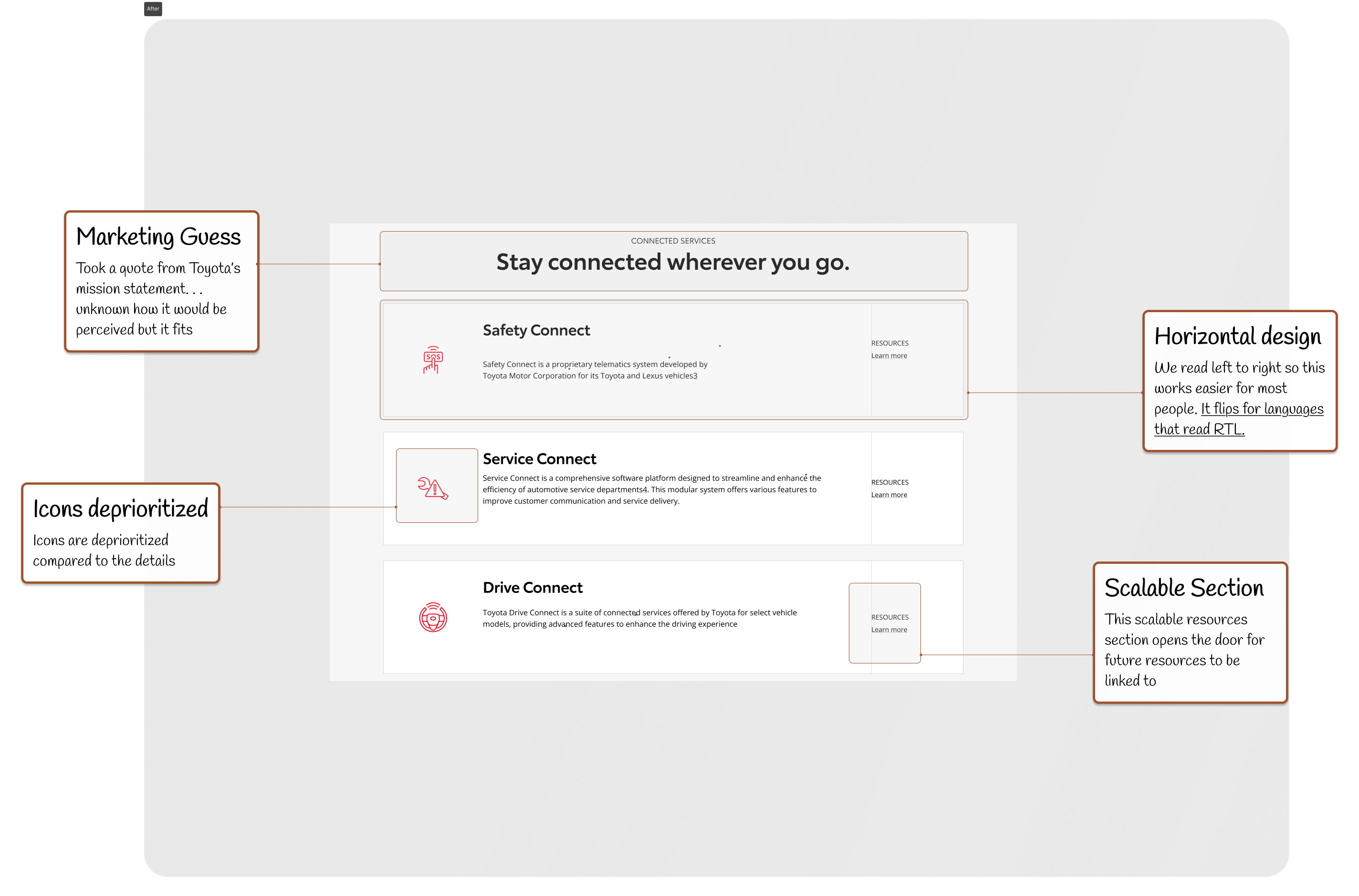
Unlike Section 1, Section X featured non-cosmetic changes like:
👉🏿 A prominent top navigation bar for easy site-wide exploration
👉🏿 A CTA input field with autocomplete functionality for make and model search
👉🏿 A visually distinct CTA button, designed in collaboration with the branding team
👉🏿 A responsive layout ensuring seamless use across devices
We implemented this solution as a minimum viable product (MVP) to quickly test its effectiveness in a real-world scenario.
What's the typical answer?
Inspired by military GPS vests, I designed Vestagogo—a Bluetooth-powered wearable that delivers navigational cues through vibration.
Final sprint
Now we had real user data, real designer feedback, and internal employee results... now it was time for the final polishing.
01
Integration feedback sessions planned
This integration process involved: 1️⃣ Collaborating with the design systems team to ensure consistency
2️⃣ Working with front-end developers to implement smooth animations and transitions
3️⃣ Creating high-fidelity mockups for every Toyota make and model using Photoshop and Sketch
4️⃣ Developing custom SVG icons for each connected service to enhance visual communication
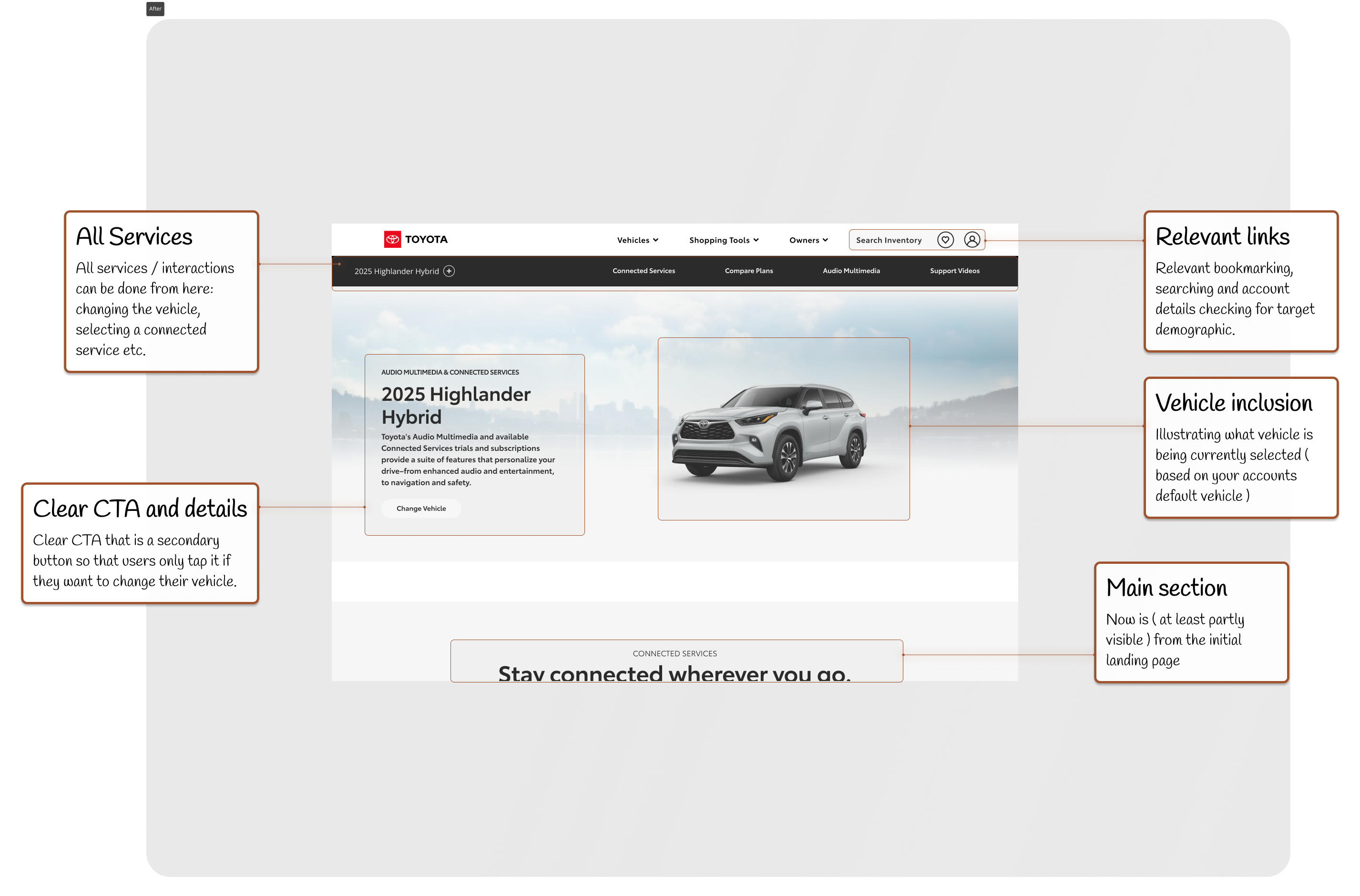
New home screen after design revisions
Feedback from other designers (UX, visual etc)
To ensure our solution aligned with broader design principles, we organized a design critique session. Key feedback included:
🟠 Suggestions to implement a progressive disclosure pattern for less common vehicle models 🟠 Recommendations to enhance visual hierarchy by adjusting icon sizes and text emphasis 🟠 Proposals for micro-interactions to improve user engagement 🟠 Discussions on accessibility considerations, particularly for color contrast and screen reader compatibility
Pain points identified
Feedback from select usability teams
After incorperating designer feedback, we then presented to the usability teams for brand alignment. This led to:
🟠 Collaboration with UX writers to refine copy for clarity and brand voice 🟠 Adjustments to color palette to better align with Toyota's brand guidelines 🟠 Implementation of A/B testing strategies for key CTA placements 🟠 Development of a content strategy for ongoing updates and maintenance of the vehicle database
Some adjustments based on the brand related teams input
Post Feedback Sessions
The project was successfully launched with minimal technical issues, thanks to thorough QA testing and close collaboration with the development team. We addressed concerns from engineers about data management and from product owners about feature prioritization, showcasing our ability to balance user needs with technical and business constraints. This redesign process not only improved the user experience but also demonstrated our team's proficiency in agile methodologies, cross-functional collaboration, and data-driven design decisions.
What's the typical answer?
Inspired by military GPS vests, I designed Vestagogo—a Bluetooth-powered wearable that delivers navigational cues through vibration.
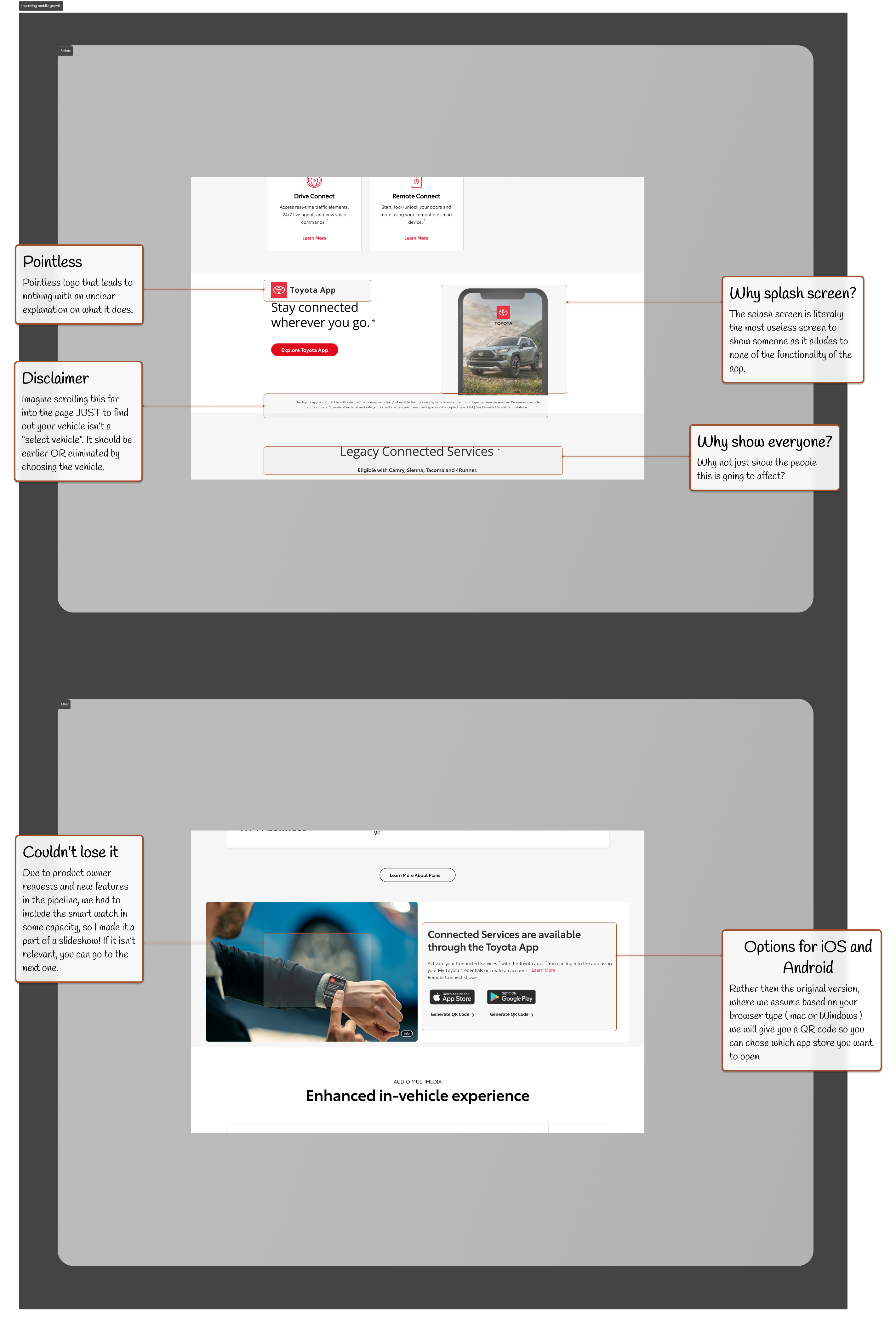
Before
The version we started with.
02
- Section X, a key page with high bounce-back behavior, was fully redesigned to emphasize scanning and learning over guessing and clicking.
- Progressive Disclosure was added for rarer vehicles and services to avoid overwhelming the average user.
- Worked closely with the branding team to balance utility and aesthetics—color contrast, accessibility, and screen-reader support were all addressed.
What's the typical answer?
Inspired by military GPS vests, I designed Vestagogo—a Bluetooth-powered wearable that delivers navigational cues through vibration.
After
The version we ended with.
02
- Section X, a key page with high bounce-back behavior, was fully redesigned to emphasize scanning and learning over guessing and clicking.
- Progressive Disclosure was added for rarer vehicles and services to avoid overwhelming the average user.
- Worked closely with the branding team to balance utility and aesthetics—color contrast, accessibility, and screen-reader support were all addressed.
What's the typical answer?
Inspired by military GPS vests, I designed Vestagogo—a Bluetooth-powered wearable that delivers navigational cues through vibration.
🏁 Outcome
02
Success! Everything worked well, was shipped and improved our user experience.
In short...
The result was a lighter, faster, and more intuitive experience. Customers could now instantly filter compatible services just by selecting their car—a small shift with massive impact.
In slightly longer...
The new filtering system transformed the Toyota Connected Services website, making it faster and more intuitive for users to find the multimedia features that worked with their specific vehicles. We reduced the average search time from 12.4 minutes to 3.8 minutes, a 70% improvement. This not only improved user satisfaction but also increased conversion rates, as users were more likely to find what they were looking for without giving up in frustration.
Key Takeaways: - Personalization is Key: Tailoring the experience to the user’s specific needs (in this case, their car model) made all the difference. - Simplicity Over Complexity: Sometimes, the simplest solutions—like a make and model-based filter—are the most effective. - Continuous Testing and Feedback: Iterating and testing early and often helped us deliver a product that met real user needs.
This project reinforced the importance of listening to users and staying focused on creating solutions that remove friction from their journey. By simplifying the experience and making it user-centered, we not only solved an immediate problem but also laid the groundwork for future improvements.
What's the typical answer?
Inspired by military GPS vests, I designed Vestagogo—a Bluetooth-powered wearable that delivers navigational cues through vibration.
🔍 Retrospective
What did we learn? What's next?
02
Biggest Wins
Personalization doesn’t need AI—contextual filtering goes a long way.
Incremental UX can scale across enterprise systems.
Collaborative testing saved months of misalignment
03
Next Steps
Explore scalable localization options.
Expand account-based filtering once legal and infra align.
What's the typical answer?
Inspired by military GPS vests, I designed Vestagogo—a Bluetooth-powered wearable that delivers navigational cues through vibration.