


Thanks for making it to the bottom! High five! I'm Sola [Sho-Lah], a product designer with a mechatronics engineering coursework and a master's in design from NYU, where I focused on interactivity research and motion design.
We should connect! I love speaking at conferences about tech, ux and research work!

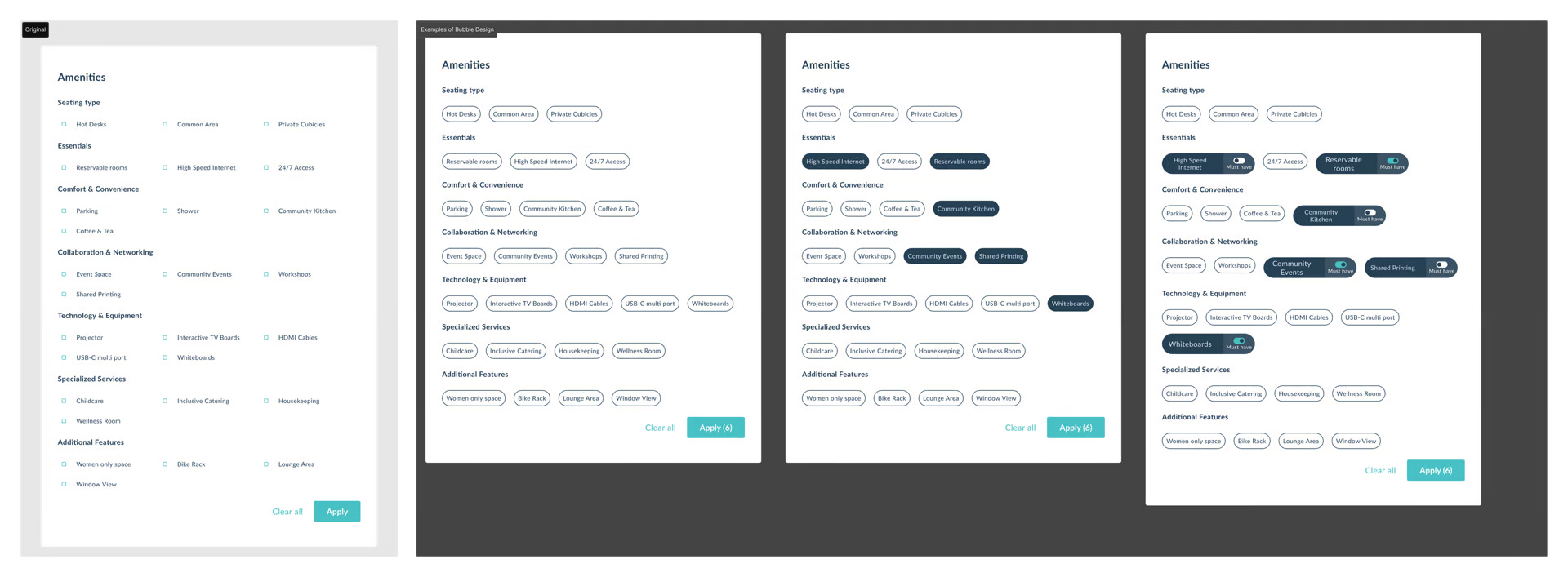
🧩 The Problem
“I can’t find a space that works for me.”
First-time users on Upflex often abandoned their search for coworking spaces due to three key pain points:
01
Irrelevant results, especially in non-urban areas
02
Confusing amenity filters
03
Map filters not working as expected
What's the typical answer?
Inspired by military GPS vests, I designed Vestagogo—a Bluetooth-powered wearable that delivers navigational cues through vibration.

