


Thanks for making it to the bottom! High five! I'm Sola [Sho-Lah], a product designer with a mechatronics engineering coursework and a master's in design from NYU, where I focused on interactivity research and motion design.
We should connect! I love speaking at conferences about tech, ux and research work!

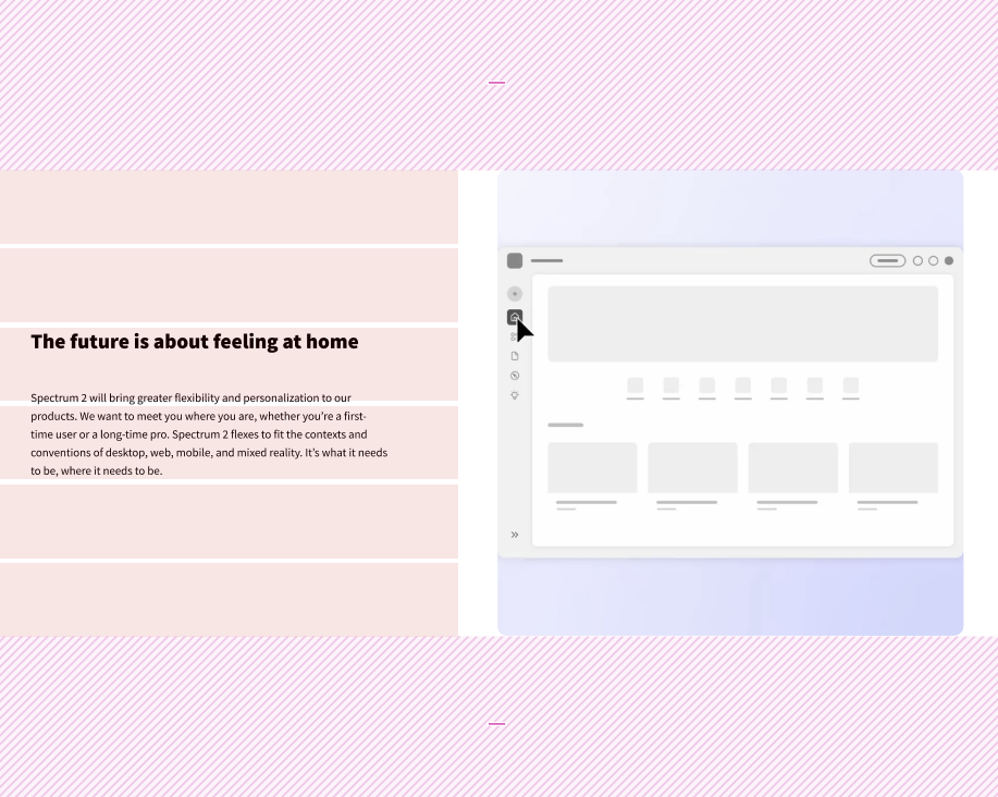
❓ What / Why / So What
Fluent 2 is Adobe’s next-generation design language. The goal was to align all Adobe cloud products to a more modern, accessible, and performant interface standard. But layout discrepancies were slowing things down. My role was to create a reusable, token-driven layout model that could be adopted across multiple teams with minimal friction.
01
What: Introduced a toggle that enables users to disable animations across the Spectrum 2 website.
02
Why: Heavy animations can hinder navigation for visually impaired users and slow down experiences for users on lower internet speeds.
03
So What: Supports Adobe’s "Design for All" principle and empowers users with more control over their browsing experience.
What's the typical answer?
Inspired by military GPS vests, I designed Vestagogo—a Bluetooth-powered wearable that delivers navigational cues through vibration.

